You will create a spreadsheet to track spending. Throughout your spreadsheet you should use labels and titles to clearly indicate the meaning of your data. Never try to put a label in the same cell as the data; that would make your data unusable!
Please pay attention to which things are just numbers (type them in) and which are formulas you need to write.
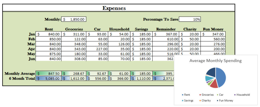
Below is an example of what the finished spreadsheet might look like (without formulas showing). Yours need not look like this.
Part A
At the top of your sheet, you should have:
In the main section there should be at least six rows, labeled with month names, and columns for areas of spending (see below).
The first four columns for each month should show the following expense categories. The numbers for these you may make up (or copy mine) and type in directly.
Part B
Then, there should be four columns holding formulas to calculate the following:
You must use formulas. Write the formulas in the January row correctly using absolute references where appropriate, so that you can then copy these down into the other monthly rows.
You may use built-in functions but do not
have to. Credit will be deducted for
improper use; (e. g. SUM(A1 +A2) and SUM(A1) are terrible uses of the Sum()
function).
(For this assignment, you can ignore the Monthly Average and 6 Month Total part of the image)
Part C
Add a pie chart that uses the values from the January row, showing how the money is being used. Since Remainder is the same as Charity + Fun Money, it should not be included in a pie chart (which should only ever show 100% of something, and never include the same values twice. You can select cells that aren't next to each other by holding CTRL and dragging (hint: Excel is confused if you click contiguous cells one by one instead of dragging).
The legend of the graph should make it clear which pie slice represents which category of spending. If you have the titles as well as the data selected when you create the graph, this should happen automatically. Adding them later is harder (it is usually easier to just recreate the graph from scratch).